Websters Dictionary doesn't make it seem very exciting now does it?
There is nothing I love more than to sit in front of a wonderful fireplace and just relax and bask in the warmth. Must have something to do with growing up in Northern British Columbia, playing all day in the winter wonderland and falling asleep in front of a crackling fire.
I have had the opportunity over the years to really showcase some really unique fireplaces.
The fireplace above is one I took great pride in designing, it features a stacked rock fascia and a Pacific Cedar rough cut mantle.
Not all Fireplace's have to be floor to cieling to be grand. Many New Home builds feature a somewhat typical builders special. In the picture above the builder was not your average builder, the black distressed mantel and surround tie in beautifully to the custom kitchen of the same finish. This is a dramatic and beautiful change from the good old white stand by's.
And so begins my tale of paint. Whenever posssible I prefer to paint out the white mantels. There is no design rule stating that the Mantel needs to match the casing.
Wouldn't you agree that the mantel looks far better and tones beautifully with the colour of the rock work surrounding it?
Of course not all fireplaces are gas. One of my past projects included the renovation for a large condominium complex in Kitsilano. Each floorplan had an electric fireplace with the typical White mantel and surround. 

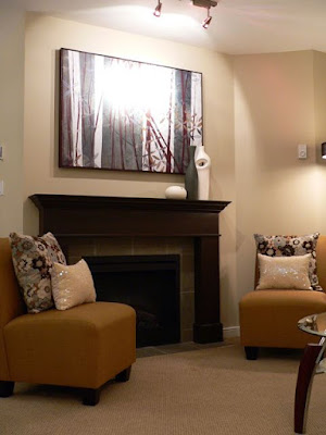
 Nothing exciting or appealing about trying to make this condo into a show suite, that is until... Now you have a focal point! By painting out the White, with an oil based (for lustre), to a rich brown it looks far more luxurious. The colour is Benjamin Moore: Bittersweet. All of the condo's had the exact same White fireplace even though there were many variations on the layout.
  Same tile too. For this suite there was a small nook just the right size for a shelving unit. The new colour scheme incorporated lots of cool Grey tones and the new hardwoood was a rich walnut. For this surround I played up the floor tones. As you can see there is a lot of trim and casing elsewhere in the space, by changing the fireplace mantel colour the living space is more defined.
In another suite the neutral carpet was kept and the white cabinetry. The sliding doors were removed to the enclosed balcony and a grey/violet colour scheme was chosen.

When this showhome sold the next suite had the identical layout, and of course identical fireplace. The new showsuite however was a complete remodel. I chose Ginger maple cabinetry throughout and a warmer colour scheme. The fireplace was professionally painted with an architectural finish to look like grained maple. Even the Realtors couldn't beleive it wasn't real wood.

In the right setting a White mantel can still look very elegant. This renovation design had a living room from the 1960's complete with wood panelling.

The surround insert was a creamy marble tile that the homeowner did themselves, while the tile seemed a bit high once the Mantel and surround were in place it didn't seem so out of proportion.

Some of my renovation design projects have included the not so nice red brick surrounds. If the brick is really dating the feel of a space an inexpensive solution to replacing it is to simply paint it out. Generally I keep this practice to the lower height surrounds as opposed to the full floor to ceiling. Here are a few examples of changing out some brick fireplaces.
Before & After
This home had the same brick in the adjoining kitchen. It was painted out the same colour.
This is just a taste of some of the projects I have had the pleasure of redesigning, with more projects on the go stay tuned for more from my recent projects with more great fireplace treatments! ~ Emily,
Emily Hagerman Design


3 comments:
I love this post. You showed so many great ways to change up a boring white mantle. I am in my living room now looking at mine thinking it needs a coat of paint! I love seeing all your beautiful designs!
What grey's did you use in the 8th picture down?
Thanks! :3
K.
Kaitlyn: Benjamin Moore, Dark colour is "Stone" and light is "Cement Gray"
Post a Comment