
 First impressions are everything and the impression these homes made was that of Confusion! Here's what I mean, the Open Great Room concept for the Living and Dining room had a fireplace to the left and a staircase to the right so it was a real challenge from a prospective buyer's point of view when they tried to imagine how their furniture would work. The furniture used in the Show home was expensive but the colours were not inspiring and didn't help to make the narrow space feel wider. The artwork while beautiful, it was rented from the Vancouver Art Gallery, didn't help to showcase the huge vaulted ceiling nor show off the beautiful Restoration Hardware Chandelier. The focal point above the fireplace with it's lone plasma TV certainly didn't inspire either.
 By removing all the Orange pieces that blended a little too close wi
 th the floor I brought in light fabrics and had custom window treatments made to dress the "ho-hum" windows. Often times just by changing the window dressing you can change a room dramatically. Added a bit of bling with the Mercury glass accents and changed out the large square glass table with an oval set. Notice I took advantage of the huge space above the TV with some simple baskets from Urban Barn.
 The Dining room table remained but the chairs were replaced with Fabulous light linen covered Parson chairs. Color was added in the toss pillows and table runner. The cushions on the sofa and chair are the same fabric as the custom drapery.
 This Dining room was stark and uninteresting....
 By changing the Monochromatic palette the end result is warm and inviting. By adding mirrors to reflect the light, the ceiling didn't seem so high and boring.
 By far my favourite element in the dining room were these amazing mirrors. They actually consisted of two separate pieces and I hung them close together to create one large mirror. When it comes to dining room artwork my recommendation is always a fabulous mirror. Usually dining rooms are not always that big especially in older homes and by adding a mirror you visually double the size of the space. Also great for those candlelight dinners to reflect the ambiance!
So now that the first impression was taken care of I moved into the next major area that needed even more attention and inspiration. The Family room and kitchen were essentially one big room separated by an immense island. The green upholstered furniture was actually quite funky but the striped pillows and tables that were too small didn't draw your eye to the colour it just felt out of proportion. The floor lamps flanking either side were also wrong in scale and one of them didn't even work. Display Homes should always have EVERYTHING working.-it is a S-H-O-W-H-O-M-E after all!
 To give the family room some definition and ground the space I added a cream rug and cream accent cushions to the sofa and chair. So many people are afraid to use cream because they are afraid of getting them dirty, every cream element I brought into the Show home was either removable or scotch guarded for ease of cleaning.
  This Family Room/Kitchen had many bright tall windows, by adding custom made valances it softened the look and the colour flow became more continuous. The kitchen was in need of some character and colour so well placed and relevant items were added.
Here is the Kitchen Before
 And After
 In having such a large island I wanted to portray it as being practical. By adding tall clear glass canister's it didn't feel cluttered but functional.

 The target market for this floor plan, Wills Creek has 4 different plans to choose from, was retired, "downsizing", or empty nesters. With that in mind the plan offers a Master on the Main with a huge en suite and walk in closet. The Master Bedroom before certainly didn't have anything to fall in love with, or even a hint of comfort. The huge King size bed had a large chest of drawers opposite it and again a whole lotta Orange!
Again my solution was to add the cream element from the other rooms and remove the oversize dresser. Who needs a huge "honkin" dresser when the closet is massive. Adding a bench to the end of the bed helped tie the headboard to the rest of the look. Did I mention I was doing two of these huge townhouse Show homes? Many of the lamps were on site when I began changing things up I would just swap them out between the rooms which was very handy, the budget for furnishing these homes originally was over $150,000 ea so I was trying to use as much as what was there as possible.
 The massive en suite needed a more Spa like feel and by adding a bit of floral it helped soften the stark surfaces.
 The frosted glass neatly hides away the toilet. Adding privacy but retaining the open airy look.
The main floor had a small office when you first walked in, but as people toured the show home the same comment kept creeping up, "Oh my Another bedroom". Even though any of the smaller upstairs bedrooms could have been used for a small den, craft room, another office, whatever, people have a very hard time imagining a space other than what they see. With that being said and since again the target audience was supposed to be "downsizers" I decided to turn one of the 3 upstairs bedrooms into a sitting den area. After all I have all this extra furniture from the living room it seemed a shame to waste it. Here is the bedroom before which wasn't anything really special...
 But by actually showing the space as something other than a bedroom people began to have less hesitations. Still shown with the possibility of having a pull out couch if needed.
 Even the top floor Laundry got a small Makeover.
 You gotta have some Whimsy!
 The upstairs bedroom needed some presence and the adjoining bathroom was a sterile as could be.
By adding colour and texture to the bed while still utilizing the existing bedding, which was quite beautiful just not pulled together, I brought the punch of colour into the adjoining bathroom.
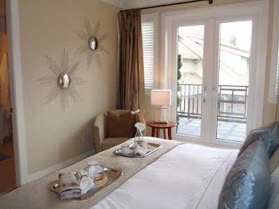
 For those prospective buyers who didn't mind the stairs there was a second style of Master Bedroom with it's own private balcony. Again using what was there I worked around the overpowering king size bed. Using the same sheet and Duvet set I added colour and texture, and beautiful artwork. The drapes were really making the room feel end heavy so by bringing the same colour and sheen onto the white the room felt more balanced. A few more bits of shiny bling to accent the lamps and the room felt wonderful.


The blue was a beautiful colour and tied in with the pillows on the main floor living room couch, so the next step was to bring this colour into the very stark, very white en suite. 
 In an effort to bring down the Town homes high price tag, since the economy had just tanked. All the glass shower partitions on the Bath tubs were removed. The maximum length of a shower rod from Home Depot was 72", the length of the shower I had to work with was over 100". I was at the Home Depot in White Rock and was racking my brains trying to figure out how to get this to work, a very nice older gentleman came to my rescue! A simple fix was to purchase shower rod expandable ends and a pre-made aluminum tube from their pipe section. Cut to size with a hacksaw and the ends fit perfectly, Voila I had custom made Shower rods!
 So with the Main, and Top level rooms Re-Designed and ready to view the last task for this home was the Basement. Complete with it's own Climate controlled Wine room the basement Rec room was seriously first class. The problem was the furnishings and decor did not reflect that. Everything looked...well...cheap!
 Knowing I had to work with the purple elephant in the room, the sectional, I tried to bring in other strong colours and give it almost a party atmosphere. Again bringin in Cream accents in the cushions and custom curtains and bold graphics on the walls. And lamps to tie in the "Stump" tables!
 Hard to beleive but they actually had a 50" Plasma sitting on a sofa table, horrible to say the least.
 Still working within a budget i decided to bring in some cabinetry to give a proper home theatre feel to that side of the enormous room. The shelving came from Ikea and once installed the marketing managers could not beleive it was from Ikea it looked very custom and high end.
 Pretty uninteresting vignette beside the Wine room.....
 Until.....
 And so with the final touches on the basement Wine/Rec Room the last room to complete the job was a large bedroom down the hall. The room had a high boring window and not much else.
  After all was said and done the Marketing Managers for EMAAR and the on site Realtors were absolutely thrilled with the transformation. I went back a couple of times when the Show homes were open to the public and hung around to listen to visitor comments. Both Women and men alike had nothing but positive comments and the mood in the homes seemed almost more upbeat! I did mention I did two of these Showhomes right? Well the next plan is for another Blog so be sure to stay tuned and follow my blog to see more great transformations! Cheers, Emily
9 comments:
Emily I can see why it took you 4 hours to post! You did a fabulous job on walking us through all the amazing transformations. The dining room mirror looks great. The bedrooms also all look so luxurious and very inviting. The wine rec room looks like a great place to play some poker. You did a spectacular job.
Just lovely! I love living vicariously through other people's designs. BTW, SITS sent me over...and I'm having a giveaway where EVERYBODY wins, so please come on by!
Hi, thanks for stopping by the blog. I'm glad you like it. I'm starting the passport process this week. My son has to get a co-signer for the application. I'm really nervous that I'm going to make a mistake and lose out on the $200 app. fee. Would love to know what your sister learned from the process, if anything.
I so want to live there!
GORGEOUS!
Stopping by from SITS to say hello!
You do amazing work! It all looks so beautiful! I too love that mirror in the dinning room. And what a great idea to put those baskets above the washer and dryer. I love it all! So cute!
Wow! What a detailed post! I can tell you love what you do!
Oh what a lovely job you did! You're right about the new window treatments - they really did give the place some style. But I often wonder these days why designers don't use books more in their designs? They can add colour and interest and fabulous shapes to a room, and make it really feel like a home...
Nice blog about Bedroom Furniture, get fabulous High End Bedroom Furniture and more from spacify.
wow, they needed you, what a transfer. In all rooms. Just proves builders should hirer a stager/ interior designer(u) cause the decor before was terrible and now it looks more rich , modern and just 100% better. I wonder how many sales they had compared to the before. lol. mishelle
Post a Comment