
 The problem was the original set up was such a mishmash of stuff that "cool" wasn't the word often used. Beginning with the Entry, this is a homes first chance to make a good impression. The large art canvas was beautiful but overpowering and out of place. By adding a sofa table, which was not only useful but also grounding, I then added a light to give drama to the new artwork.

The showhomes had a great deal of furniture that was already going to be used in the re-design, the artwork was all being sent back to the gallery and I chose new prints. I also added the ever important window coverings to break up the white walls. The den was an interesting task as the family room was adjacent to it, by adding pop's of pattern and colour the bland sectional begain to welcome you into the room.

The living room had beautiful furniture however the amount of arm chairs was not only confusing but also interrupted the flow to the patio doors.  By completely re-arranging the seating configuration and removing two of the four large chairs the space felt open and made sense.
  The dining room was as large as the living room and had an enourmous, solid (heavy too I might add) birch wood table with 8 pinstripe chairs. The large canvas was again beautiful but this space just wasn't right for it. The long buffet needed more "oomph".
  I searched for almost a week before I found this beautiful round mirror at Bowring. I could have gone larger but I was running out of time between getting these homes set and ready for the re-opening.
 By completely re-arranging the seating configuration and removing two of the four large chairs the space felt open and made sense.
  The dining room was as large as the living room and had an enourmous, solid (heavy too I might add) birch wood table with 8 pinstripe chairs. The large canvas was again beautiful but this space just wasn't right for it. The long buffet needed more "oomph".
  I searched for almost a week before I found this beautiful round mirror at Bowring. I could have gone larger but I was running out of time between getting these homes set and ready for the re-opening.
The table before seemed to float on the cherry floor. 

An incredible rug from Chintz & Co. did the trick and tied the striped rug from the den in nicely. 

The long low buffet was a beautiful built in feature and I chose huge Hurricane Lamps from Bombay to complete the vignette. If these baby's hadn't been the last ones I'd have them on my own buffet!  The main level had a generous size powder that was in need of some serious accessorizing!
 The main level had a generous size powder that was in need of some serious accessorizing!
 It's the simple touches that make the most impact in a bathroom.
  The top floor landing had a perfect area for a den or office. The original office set up was dark, stark and BORING. I took the one large bookcase and gave it a new home in the downstairs den. The lifeless windows received custom vallances and the extra chairs from the living room were added. Did I mention I love clocks?! My favourite clock store is actually Target! Worth the wait in the border line up!
The master bedroom needed some life and colour injection, but the original silk drapes and custom duvet were utilized. 

The lamps were changed out and cushions added. 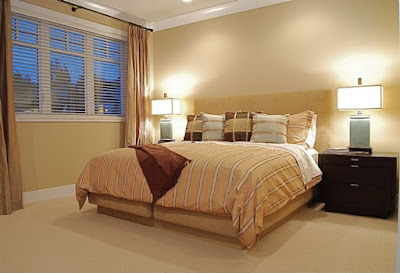

The only thing the Ensuite mastered was being ugly. 

So to create a Master Ensuite the teal blue from the Master Bedroom was injected with the towels and shimmering accents made the soaker tub more appealing.

The second level also included two good size bedrooms, in the first I changed the positioning of the bed and replaced the orange headboard with a new queen size bed. The plain white bedding was also removed. 


The second bedroom just needed some interest and finishing. Can you believe the before picture was actually being shown to prospective buyers? 


With the top two floors finished the focus then became the basement. At the bottom of the stairs was a large room that had ben left empty. 

At first the simple solution was okay, a bedroom. 

 But then that put the house at FIVE bedrooms, not to mention this room didn't have a closet. After much discussion the marketing team decided to order a complete gym system and had it delivered. I added the full length mirrors and 'Viola', home gym.
The basement did have another bedroom but at least this one had a closet!


 A generous size basement bath...really needed a little love. By re-using some of the many accesories from other areas of the home the bath when from "Blah" to "Spa".
Now if you remember from my blog about "A" plan, the basement there featured an amazing wine room. In this home the basement featured a fabulous Home Theatre. Well.. maybe not so fabulous at first unless you were Joey and Chandler! 

Having to use what was there, I pushed the leather recliners together for a much better look. 

Inject a little colour and some fun and this home theatre was a hit! 

Not to mention the fabulous bar area, complete with an added popcorn machine!

 With the new look complete, the showhomes have been extremely well received. I received an email last week letting me know that both the showhomes had in fact been sold and that they were preparing to choose a new site for a new Showhome. Stay tuned, I'm meeting with the marketing team tomorrow to find out the details. Hopefully I'll have another blog for another day on these fabulous townhomes! ~ Emily


