Tuesday

Wills Creek Showhome Captivates a Buyer...


We have had such an amazing Summer here in the South Surrey it's hard to see it end. But with a new season comes new adventures. Last Fall I had the oppotunity to re-design the showhomes for Wills Creek. If you missed my blog on the "A" Suite- click here. The second showhome was the "C" plan. What is so fantastic about these townhomes, aside from their awesome finishes, is their unique layout. Once the homes received my finishing touches the atmosphere in each was truly it's own. Feedback from the realtors was interesting, they knew even before clients had finished the tour of each which one they would most likely gravitate to depending on their age. Even our friends who had been through the showhomes, whether they knew I had re-designed them or not, were always partial to the "C" plan. This plan had a bit of a hip vibe to it. Even before I re-designed the space I envisioned this home being a little more modern and contemporary.

The problem was the original set up was such a mishmash of stuff that "cool" wasn't the word often used. Beginning with the Entry, this is a homes first chance to make a good impression. The large art canvas was beautiful but overpowering and out of place. By adding a sofa table, which was not only useful but also grounding, I then added a light to give drama to the new artwork.


The showhomes had a great deal of furniture that was already going to be used in the re-design, the artwork was all being sent back to the gallery and I chose new prints. I also added the ever important window coverings to break up the white walls. The den was an interesting task as the family room was adjacent to it, by adding pop's of pattern and colour the bland sectional begain to welcome you into the room.

The living room had beautiful furniture however the amount of arm chairs was not only confusing but also interrupted the flow to the patio doors. By completely re-arranging the seating configuration and removing two of the four large chairs the space felt open and made sense. The dining room was as large as the living room and had an enourmous, solid (heavy too I might add) birch wood table with 8 pinstripe chairs. The large canvas was again beautiful but this space just wasn't right for it. The long buffet needed more "oomph".  I searched for almost a week before I found this beautiful round mirror at Bowring. I could have gone larger but I was running out of time between getting these homes set and ready for the re-opening.
The table before seemed to float on the cherry floor.
An incredible rug from Chintz & Co. did the trick and tied the striped rug from the den in nicely.
The long low buffet was a beautiful built in feature and I chose huge Hurricane Lamps from Bombay to complete the vignette. If these baby's hadn't been the last ones I'd have them on my own buffet! The main level had a generous size powder that was in need of some serious accessorizing!
It's the simple touches that make the most impact in a bathroom.
The top floor landing had a perfect area for a den or office. The original office set up was dark, stark and BORING. I took the one large bookcase and gave it a new home in the downstairs den. The lifeless windows received custom vallances and the extra chairs from the living room were added. Did I mention I love clocks?! My favourite clock store is actually Target! Worth the wait in the border line up!
The master bedroom needed some life and colour injection, but the original silk drapes and custom duvet were utilized.
The lamps were changed out and cushions added.
The only thing the Ensuite mastered was being ugly.
So to create a Master Ensuite the teal blue from the Master Bedroom was injected with the towels and shimmering accents made the soaker tub more appealing.
The second level also included two good size bedrooms, in the first I changed the positioning of the bed and replaced the orange headboard with a new queen size bed. The plain white bedding was also removed.

The second bedroom just needed some interest and finishing. Can you believe the before picture was actually being shown to prospective buyers?

With the top two floors finished the focus then became the basement. At the bottom of the stairs was a large room that had ben left empty.
At first the simple solution was okay, a bedroom.
But then that put the house at FIVE bedrooms, not to mention this room didn't have a closet. After much discussion the marketing team decided to order a complete gym system and had it delivered. I added the full length mirrors and 'Viola', home gym.
The basement did have another bedroom but at least this one had a closet!
I just love these beds, you can find them at Lofty Living 
A generous size basement bath...really needed a little love. By re-using some of the many accesories from other areas of the home the bath when from "Blah" to "Spa".
Now if you remember from my blog about "A" plan, the basement there featured an amazing wine room. In this home the basement featured a fabulous Home Theatre. Well.. maybe not so fabulous at first unless you were Joey and Chandler!
Having to use what was there, I pushed the leather recliners together for a much better look.
Inject a little colour and some fun and this home theatre was a hit!  
Not to mention the fabulous bar area, complete with an added popcorn machine!

With the new look complete, the showhomes have been extremely well received. I received an email last week letting me know that both the showhomes had in fact been sold and that they were preparing to choose a new site for a new Showhome. Stay tuned, I'm meeting with the marketing team tomorrow to find out the details. Hopefully I'll have another blog for another day on these fabulous townhomes! ~ Emily

Friday

Heavenly Bedroom Transformations


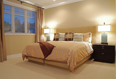
Today I was helping our very best friends paint a little old house that they had just bought for investment purposes. They will have it rented the middle of next month but in the mean time I've been helping them give the little old house some freshening up and also a bit of an excuse to experiment with some colours I'd been dying to see in person. The little house has two bedrooms and as I was painting my cares away I started to reflect on some of the bedrooms I had done in the past two years for clients and builders. So I'm dedicating this blog to some of by favourite Bedroom transformations. The picture above was a show home in Kerrisdale that a Stylist and I staged.

 This next bedroom was for a client from Bermuda who purchased a vacation home in Kitsalino. The guest room before was bland and boring.

This bedroom was on the top 3rd floor and had it's own balcony, huge ensuite, and window facing the beach. I chose Benjamin Moore colour: Mount Saint Anne CC-710 for all the walls. This beautiful blue green colour gave this room a seaside feel. The furniture was from Ethan Allen and Pebble Creek.

In addition to the Queen Poster Bed the client requested an extra sleeping arrangement for their guests with children. I chose the Franklin Chair & a half as it can fold out into a single bed.
As always I addressed the windows with some custom panels to soften the hard edges of the windows and door.

This next bedroom was a show siute for the Maguire Building in Kitsalino. The long tunnel shaped room was a real stumbling block for potential buyers.

By addressing the window as the focal point the length of the room was brought in closer.


This bedroom also had an awkward little nook area and since we already had a formal office in the suite the space was perfect for a reading nook.

This next bedroom was a tight budget and a simple fix was to focus on the bedding and make the bed the show piece in the room. Inexpensive Ikea panels also transformed the windows.

The Master Bedroom in this next White Rock home was in need of some serious updating. The clients had moved to their new beachfront estate and this home was to be put on the market. In order to appeal to as many buyers as possible and to acheive their asking price, myself and a Staging Stylist staged the rooms and new paint colours were chosen.

The owner wanted the home on the market the minute they moved out so the window to paint, clean and stage was very small. Therefore any structural updating was not an option. The 80's inspired "vanity in the bedroom" was not removed but just modernized with accessories and a cool clear acrylic chair.

I'm sure every designer has met the renter from hell, well this home was no exception, the only positive was that it made for a mind blowing transformation.

The other 2 bedrooms were also transformed and with the help of the owners contractor the awful built in's were removed.


The colour of a room can also make or break a bedroom, in this bedroom the Olive green walls were the perfect backdrop for a Black, White, and Silver design.


This next bedroom is from my latest renovation project and is a sneak peak into an upcoming blog.


Bedrooms are one of my most favourite rooms. Not only to decorate but the space planning is an intrigal part of making a bedroom work. From lighting to flooring no detail goes untouched and I fell that is reflected in my portfolio in this blog.
If you need any bedroom design help be it large or small please don't hesitate to contact me and ask for a consultation. ~ Emily 
Emily Hagerman Design ~ Interior Design, Property Styling, Virtual Space Planning, Colour Consultation.

Tuesday

1970's Beach Grove Home Get's a New Lease on Life...

The late Seventies, early Eighties had some really wonderful design elements to the homes that were being built in that era. The problem is, most still have all the nasty macrame inspired wallpaper, carpet and drapes that the 7o's were so famous for. On more than one occasion I have stepped into one of these homes and thought for sure Eric Foreman's dad was about to walk down the stairs!
Vaulted Ceilings, cedar panelling, and even terrariums were big elements during this period. I am always drawn to the West Coast style homes, heck I even live in an 80's Jenish built home, I guess because the bones of these homes are what inspire me. When I was hired on to renovate and re-design a Home in Beach Grove Tsawwassen I knew that this diamond in the rough would be sparkling!
This project was a complete overhaul in every aspect, not only did I find myself designing all the interior and exterior features, many times I ended up being the project manager which was a new role for me that I was able to embrace. The entire exterior envelope had to be replaced and the amount of rot due to the original siding installation done incorrectly was immense. The absence of proper drainage and gutters only compounded the issue and not a single piece of cedar siding or trim was salvageable.
Funny how in life sometimes those obscure jobs you had when you were first starting out in the world can come in handy. A few years back when I was fresh out of school and newly married with a mortgage to pay for among other things, I was juggling 3 jobs and one of which was for a Wood & Forestry company that dealt in Siding claims for Homeowners. That obscure job that I learned so much about was about to come in handier than any of my Interior Design schooling, sorry BCIT! I was able to determine what would be needed to change the exterior envelope to ensure the new siding would be effective and had all the proper drainage installed where I knew the proper run off would be, flashing was non-existent on the original so that was a big priority for me as well.
The fun design stuff came with trying different siding profiles to update and break up the long blank walls of this large home. By using vertical siding as well as Horizontal the home was given some character as seen below in the before and after of the side profile.
The front of the home also had some great focal features that had yet to be utilized. Above the garage between the two bedroom windows a center wall was screaming for something architectural. My initial thought was to use some fabulous cultured stone, as this house was going to be re-sold budget wise I chose shakes instead. These same shakes were then used on the front elevations around the front door and upper deck. The original deck was also replaced and to capture the ocean view across the street, I chose glass railings.
The original front doors were big, heavy and ugly, the sidelights had yellow and green stained glass but no natural light was able to get through and from the inside the entry hall felt small and narrow. By changing the doors to full stained glass with matching sidelights not only did it let beautiful natural light in, it also became the jewel of the front of the home. Everyone who sees this home, even from the sidewalk loves these doors.


The interior of the Entry hall received new Porcelain tile, crown and baseboard, the only original element were the pot lights. The light those doors allow in make this entry so inviting.

This home's main level was being used, more like abused, by the original owners for grooming their dogs and the bedrooms make-shift kennels. You seriously could not imagine the smell. The main level also had a small kitchenette that we set up as an in-law suite. The Den fireplace received a face lift with the stacked cultured stone that was also used in the great room. We used engineered flooring on the main level and suite.
The home's real beauty shone through as the weeks went on, the project went over on time due to unforeseen plumbing and electrical issues that had to be completely re-done but when renovating a home of this era this is not uncommon. The main level is where the major level of finishing and design was showcased. Please be sure and tune in for a continuation of this project in my next blog. ~Cheers, Emily
Emily Hagerman Design